In the United States, people always like to call Chevrolet Chevy, which is as intimate as calling a member of their family. Chevrolet’s bow tie logo was designed by company co-founder William Durant. In this article, let’s talk about the history of the Chevrolet logo.
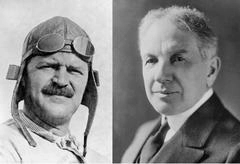
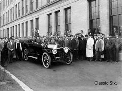
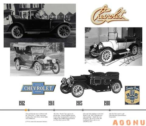
On November 3, 1911, William Durant and Louis Chevrolet combined the vision of a mainstream civilian car and the dream of racing to co-found Chevrolet. The following year, the Chevrolet brand launched its first model, the Classic Six (Series C).
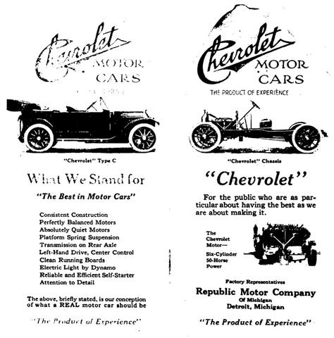
The Chevrolet Classic Six was definitely a luxury car at the time. Its powertrain was equipped with a maximum power of 40 hp and six-cylinder engines. The price was as high as $2,150, while the average price of American cars was only $800-900.
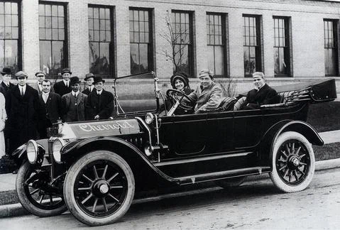
Chevrolet originally used the handwritten “Chevrolet” as the brand logo, with the letters on either side of the hood. However, William Durant wanted to make a more popular car, so the two founders parted ways and Louis Chevrolet left the company.
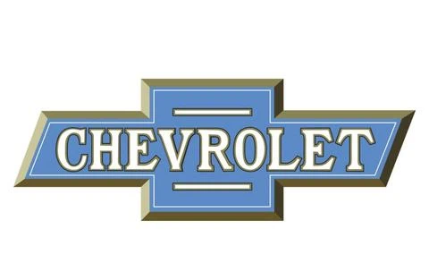
On October 2, 1913, Chevrolet Bow Tie logo debuted in an advertisement in the Washington Post. This logo symbolizes the generosity, style and demeanor of the Chevrolet brand, and also conveys the Chevrolet concept of “making a high quality popular car”
There are several kinds of sayings about the source of inspirations of Chevrolet Bow Tie logo. The first one: “In 1908, William Durant tore off the corner of the hotel wallpaper during his trip to France. He thought that the pattern on the wallpaper would be a great car logo.”
The above saying comes from the official book “Chevrolet Brand Story” published in the 1961 brand’s 50th anniversary, and the second saying came from the book “My Father” by William Durant’s daughter Margery.
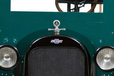
Margery mentioned in her book the situation of her father sitting at the table with graffiti: “I think it should be one night, between the cups and the bowls, he outlined the signs used by the Chevrolet cars on paper.”
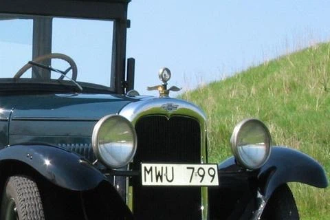
The third saying was provided by William Durant’s widow, Catherine, who recalled that during her vacation with William Durant in Virginia in 1912, When her husband read the newspaper at the hotel, he pointed to a pattern saying: “This is a good logo for Chevrolet.”
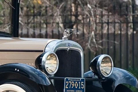
There is also a version from Ken Kaufman, a Chevrolet historian who believes Chevrolet’s Bow Tie logo was Inspired by the advertisements of Coalettes Coal Company published in the Atlanta Constitutional News on November 12, 1911.
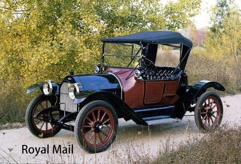
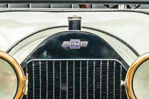
On the 1914 Royal Mail (H-2) and Baby Grand (H-4) mode, the Chevrolet Bow Tie logo was first seen in the center of the car front. The original logo was designed in white on a blue background with a horizontal line above and below the letter on the middle of the Chevrolet.
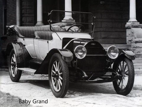
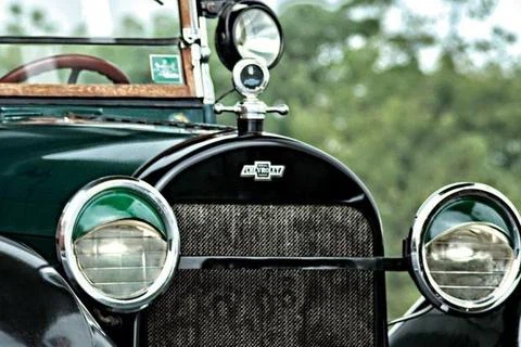
Chevrolet’s first logo was used until the end of the 1930s, but the logo has been changed many times and matched with different background elements. In the National (AB) series, introduced in 1928, the Chevrolet features a bow tie logo embedded in a horizontal, winged gold oval.
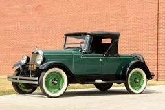
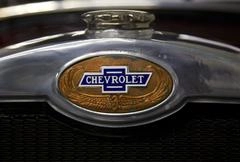
For example, during the period of 1929-1931, the bow tie logo of the car front position was in the form of a lengthways, light blue ellipse with vertical stripes. During the period of 1934-1937, the background of the bow tie logo was replaced again, while the bow tie pattern has also been added on the rim cover.
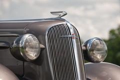


With the outbreak of World War II in 1939, the Chevrolet logo changed for the first time. The brand name was moved to the outside of the bow tie. The civilian car logo’s pattern was changed like a sharp blade, and the bow tie became an element in the sharp blade.
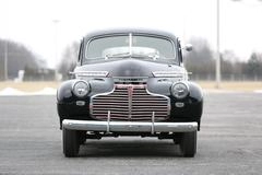




During the war, Chevrolet’s military vehicles hoisted the bow tie logo directly. After the United States entered the war, the Chevrolet passenger car was replaced with a shield-shaped logo, and the truck continued to use the sharp-blade logo. Both logos retained the bow tie elements.


After the war, Chevrolet passenger cars were designed with various shield-shaped logos with bow-tie elements depending on the model. The Chevrolet truck has been hanging a logo with a bow tie on the top and the brand name on the bottom since 1947.
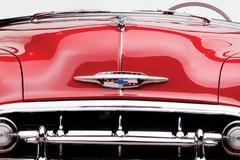
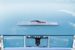

Since 1952, Chevrolet has redesigned its more versatile shield-shaped logo for its passenger cars. And the new sports car Chevrolet Corvette, which was introduced in 1953, has a unique cross double-flag logo.
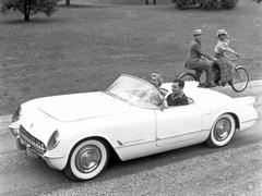
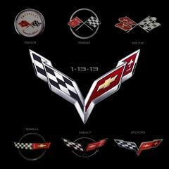
The Corvette logo has undergone many innovations, initially using a white disc design with a cross double-flag in the middle as the main body, a checkered flag on one side and a red flag with a gold bow tie and lily pattern on the other side. The top and bottom of the flag are Chevrolet and Corvette in English.


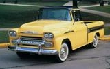
In 1954, Chevrolet trucks began to use the shield logo with red bow tie elements, but the style was different from the logo of the passenger cars. In 1956, with the application of the V8 engine, Chevrolet once added “V” to the logo of passenger cars and trucks.

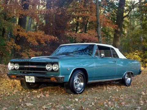
Since 1959, the design of the red bow tie logo on the Chevrolet truck has gradually simplified, while the passenger car continues to use the blue bow tie-centered shield logo until 1964, then the blue bow tie logo has also turned to a simplistic design.
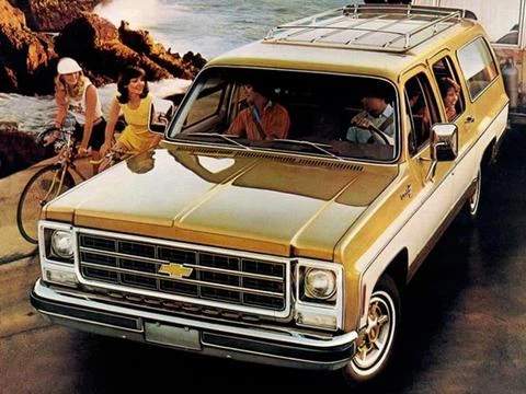

In 1969, Chevrolet models all adopted blue bow tie logos. And the by 1973, Chevrolet trucks including SUVs and pickups had been replaced with gold bow tie logo, while Chevrolet passenger cars continued to use blue bow tie logo until 2003.
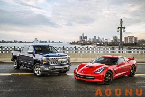
Since 2004, Chevrolet has used the gold bow tie as the logo for its branded passenger cars and trucks worldwide, but the Corvette series sports car continues to use the personalized logo consisting of two flags.
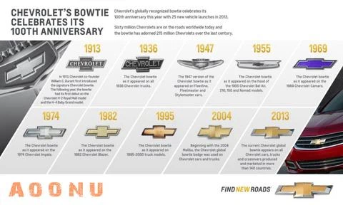
In 2013, the Chevrolet bow tie logo ushered in a hundred years of birthday, the latest gold bow tie logo with chrome frame. In addition, Chevrolet also launched a new brand vision “Find New Roads” to commemoration.

Although the origin of the Chevrolet bow tie logo is a mystery, more than 230 million Chevrolet cars, SUVs or trucks have worn the bow tie logo over the past 100 years, and the logo has become synonymous with American Creative spirit.

