When you saw the car on the road, even if you are not a car enthusiast, you can easily recognize the BMW car. The reason why the BMW is easy to identify is not only because of the BMW family-style face that everyone is familiar with, but also because of the classic “blue sky and white clouds” logo on each BMW. BMW circular logo has undergone only four minor modify in the past 90 years, which is easy-to-remember, easy-to-identify. The BMW logo that we saw now is only slightly different from what it was first designed. So how was this classic logo designed at the beginning? What changes have been made in the next 90 years? Let me take you to learn about the historical story behind this classic logo.

1917: The birth of the BMW logo
BMW’s predecessor was the Rapp Motorenwerke aircraft engine manufacturing firm and it was Located in Munich, Germany. The engine factory, founded in 1913, mainly produces V12 engines for aircraft use. In February 1917, a talented engineer from the Daimler engine factory, Max Friz, joined the Rapp Motorenwerke aircraft engine manufacturing firm and successfully developed an excellent inline six-cylinder engine. Due to the great success of this engine designed by Feliz, the Rapp Motorenwerke aircraft engine manufacturing firm, a obscure company, was quickly reorganized. At the same time, the company’s partners decided to change the company name to Bayerische Motoren Werke AG, and the new company name for BMW is now known as the “BMW”.

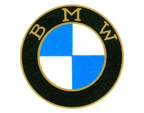
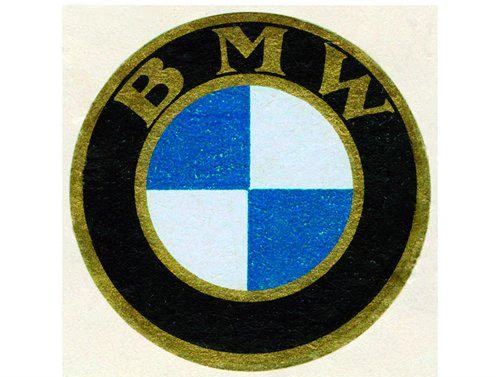
Although the name of the company has changed, the name and logo of the company have still appeared in the company’s letterhead. In order to reflect the new name, the company decided to redesign a logo. Since the BMW company was reorganized by Rapp Motorenwerke aircraft engine manufacturing firm, the new logo was deliberately designed with a style similar to the Rapp Motorenwerke logo and its letter arrangement. Finally, this new logo continues to use the Rapp Motorenwerke logo’s inner and outer double circular design, and the outer ring is black. Replace “RAPP” with “BMW”, and the inner circle pattern is changed to fill the entire circle by four blue and white fans. The blue and white tones in the pattern are taken from the blue and white Bavarian flag to symbolize the new company name.

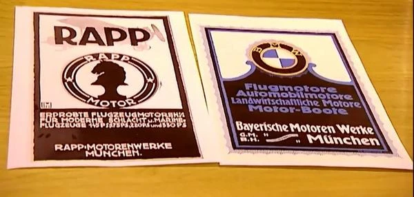
The BMW logo in the picture can only be regarded as the “template” of BMW logo in that historical period. Although the logo used in BMW’s printed matter is consistent with it, the BMW logo found on motorcycles and cars were slightly different from it. The most obvious difference is that they add a “ten” gold line in the small circle printed with “blue sky and white clouds”. The “ten” gold line has the same color as inner and outer double-circle border and letters. We can use this feature to distinguish the use of the logo.

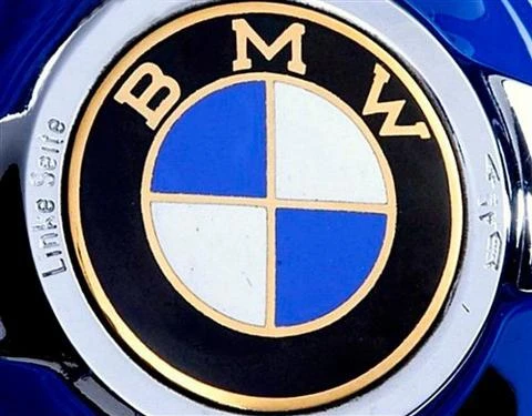
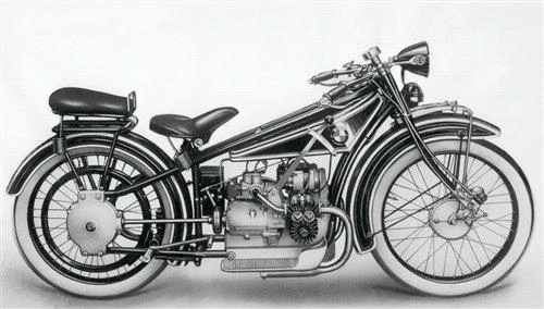
The BMW logo first time “go on the road”
After the four years since the new BMW logo was designed, the logo has only appeared in the printed documents inside BMW. Until five years later, in 1923, with the introduction of the first BMW motorcycle model R32, it appeared on the body of the motorcycle. This is the first time people can see this brand new BMW logo on the road.

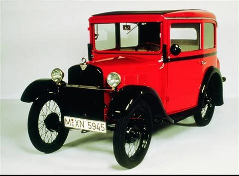
The first car with the BMW logo
By 1929, BMW had launched its first car, the Dixi 3/15 PS. Although this was the first car with the BMW logo, this car was authorized by the British Austin Motor Company to BMW, not developed by BMW itself. Now, it seems that the Dixi 3/15 PS is just a BMW car with the BMW logo.

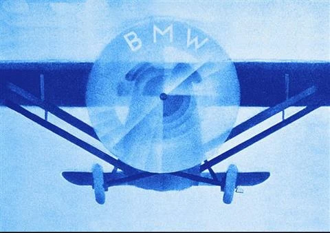
On the cover of a BMW magazine published in the same year, the blue and white pattern in the BMW logo was used to represent the propeller that kept spinning. It seems to remind people not to forget the great achievements BMW has made in aircraft engine technology in the past.

1933: A more calm and noble BMW logo
With the expiration of Austin’s auto production authorization in 1932, BMW decided to develop its own design car from now on. The first finished product was the 303 model launched by BMW a year later. For the first time, this new car features BMW’s signature kidney-shaped grille on the front of the car. Since then, the double-kidney grille on the front of the BMW has become the second “sign” on the BMW. Not only that, the 303 model is also the first car equiped with inline six-cylinder engine. Since the introduction of the 303 model, BMW has begun to use the three-digit number to distinguish the models. All of these feature can be found on the current BMW car. Most importantly, it is officially recognized as the first BMW car by BMW! It is also the first BMW car to be affixed with the BMW logo.
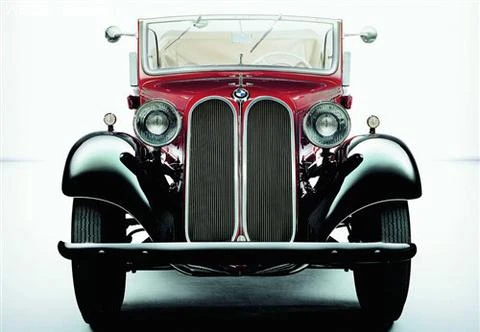

Compared with the distinguished BMW 303 released in 1933, BMW’s modification of its logo in the same year was “not so important”. The small modification of the logo did not attract much attention. The relevant records are also very few. The reason why BMW decided to amend its logo at this time was simply to comply with the development of the times. Although the modified BMW logo has a small change from the 1917 edition of the BMW logo, the bold double-circle golden border and fonts really make it look more calm and noble. When BMW decided to develop its own car at the beginning, they took a fancy to the mid- to high-end car market at that time. It seems that the more steady and noble logo style is more in line with this new image.

1953 (or 1954): the younger BMW logo
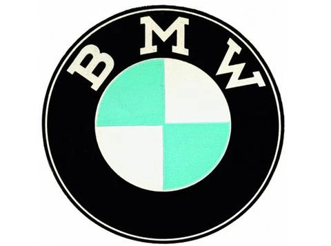
In 1953 (or 1954), BMW revised its logo again (BMW official data, the logo modification had two different time records). The new BMW logo has changed to a white double-circle border, a white “BMW” letter and a light blue pattern in the middle, which looks younger.

(Note: Regarding the reason why BMW Company revised its logo in 1953, it is still not possible to find official and other relevant information. anyone who know the reason can contact us and we will improve this part.)
According to relevant information, before the launch of this new logo, BMW did not have very strict specifications on the previous old version of the logo. Although the inner circle pattern of “Blue Sky and White Clouds” has never changed, there is no uniformity in the “BMW” font color and style, the double circle border thickness and the color. Product designers can make detailed adjustments on BMW’s logo “template”, making the BMW logo type very complicated at that time. However, after the revision of the 1950s, BMW completely abandoned the golden double-circle border and the golden color of the letters in the design of its logo. They stipulated that white double-circle borders and letter as the BMW logo used on the BMW company printed matter. The BMW logo on motorcycles and cars is a color scheme with silver double circles and white “BMW” letters.
A BMW car that gives the BMW logo a new meaning
When talking about the BMW logo of the 1950s, it is inevitable to mention the Isetta, a BMW minicar. Because the BMW logo on this car represents a different meaning that is excellent economy. Since the luxury cars introduced by BMW in the early 1950s were extremely expensive, and they greatly exceeded the spending power of most Germans at that time (after the end of World War II, the economy was still recovering). Therefore, the sales of luxury BMW cars on the market can only be described as bleak. In order to reverse this situation, BMW bought the production license for the Isetta from an Italian car company (including all the design drawings). After some modifications, it started production and was introduced to the market in 1955. BMW intended to entered the low-end market with this car and through high sales to alleviate BMW’s huge economic pressure at that time.

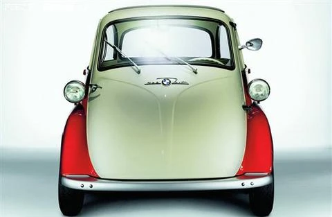
Isetta did not disappoint the BMW company. As soon as the new car went on the market, it was popular for its playful and cute body shape. Quite a low price and good fuel economy made the sales volume of this BMW car with no BMW bloodline had accumulated more than 160,000 units. The sales volume greatly alleviated the huge economic pressure of BMW at that time. At that time, it also broke the impression that BMW car were luxury car.
1979: A more technical BMW logo
In the 1970s, under the leadership of the most outstanding CEO of BMW history, Eberhard von Ginheim, BMW from a relatively niche brand to be a high-end car brand that could compete with Mercedes-Benz. The difference was that BMW was not only pursuing a luxury route. BMW’s first generation of the BMW 3 Series (E21) Coupe, launched in 1975, laid the foundation for BMW’s philosophy of emphasizing the superior handling performance of the vehicle. After the launch of the BMW 3 Series, it was very popular in the market and its sales performance was very good. Later it became a car model with largest sales volume by BMW.

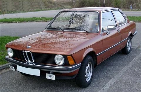
In addition to the style of luxury and sports, BMW was also very active in developing new technologies and applying them to their own products for the first time. The best example of this is the first use of DME in 1978(Digital Motor Electronics, the microcomputer used to control the engine, is synonymous with what we call the ECU. But the DME function at the time is relatively simple). DME made engine operation more efficient than ever. Since then, the BMW logo has also been given the “ultimate driving machine” and represented the meaning of advanced technology. The BMW company also revised its logo again in 1979.

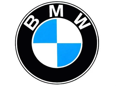
The third time modification in the history of BMW logo, the change still very small, including changing the light blue sector of the old logo back to sky blue and replacing the slightly outdated font. The revised new logo is more dynamic, and it has a little more scient technological sense based on the characteristics of the previous version of the logo rejuvenation. At the same time, it is more able to convey the characteristics of sports and high-tech that are emphasized in the products at that era.
2007: Modern BMW logo
The last modification of the BMW logo was in 2007, and the change was still small. It is based on the old version of the logo to add a three-dimensional effect. The modified logo not only retained all the characteristics of the old logo, but also more eye-catching, dynamic, and more modern. After emphasizing “power and handling” performance many years ago, BMW chosed to change its logo at this time in order to make the new icon more in line with the characteristics of modern BMW.
